Responsive Widgets
Providing a consistent on-brand experience to your users is at the heart of Brandworkz and the responsive widgets allow you to do this. The widgets allow you to enrich your Brandworkz pages with information and functionality whilst being responsive to different browser sizes and devices of your users. The content, style and behaviour of these widgets are highly configurable, meaning they can be updated easily to help keep your site looking new and fresh as well as promoting new things as and when you add them. To get the most of these widgets please speak with your Brandworkz contact, who will be able to provide guidelines, best practice examples and coordinate the design updates to your templates.
Brandworkz 8.3 introduces these three new responsive widgets:
- Search Widget
- Carousel Widget
- Quick Links Widget
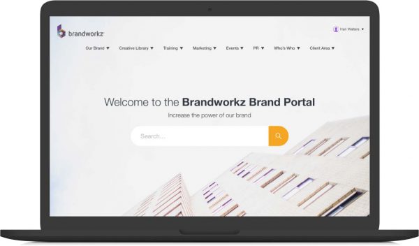
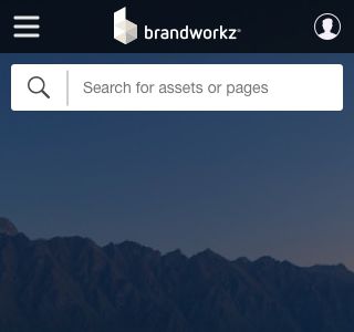
1. Search Widget
The search widget brings a modern, highly configurable search bar to your page. The look and feel of the search bar is configurable to fit in with the design of the rest of your page. Included in the widget is the ability to add supporting content using the Brandworkz rich text editor and apply pre-defined search queries.
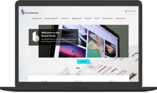
2. Carousel Widget
The carousel widget brings an updated, responsive carousel slider to your page. You can have one slide as a hero or add additional slides to create a presentation loop. This is a good widget to use on the homepage to highlight key areas to direct your uses too.
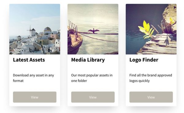
3. Quick Links Widget
The quick links widget adds an attractive card-like layout to your page. The quick links are applied in rows and can be configured to have multiple rows and numerous quick links per row where the layout will adapt to end-users various screen sizes and devices.
Full-width mode incl. more configurable masthead
Utilising the entire width of your browser will give you more space to work with your assets. With Full-Width Mode enabled your layout will be more responsive across the site. For example, the asset thumbnails on the search results and DAM pages will automatically allow for more assets per row as you expand your browser. On devices with a more restricted browser width such as a mobile device, the masthead will adjust accordingly to give you more space to work.
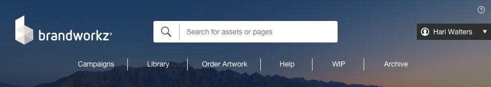
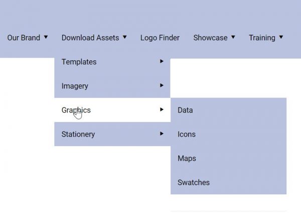
To improve the user experience and ability to navigate the site more easily a site can have up to three levels of navigation entries on new, full-width masthead:
Accessibility
We have made accessibility improvements across the board in Brandworkz to make it possible to meet the WCAG 2.1 Level AA standards. We have also introduced an “Accessibility Checker” button in our CMS editor, which allows you to check your pages for accessibility.
WCAG 2.1 is the global web standard to ensure that people with sight impairment can access web sites. There is a good article about it here
https://www.gov.uk/service-manual/helping-people-to-use-your-service/understanding-wcag
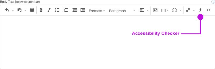
In addition to making the Homepage, CMS, DAM and Search pages WCAG 2.1 compliant, we have built a tool to enable you to check your own CMS content is compliant too. The built-in accessibility checker looks at the accessibility of the following:
- Use of paragraphs as headings
- Sequential headings
- Adjacent links
- List structures
- Contrast ratio of text
- Image ALT text
- Table structure
Please ask your Brandworkz contact for more details on how to make your site fully accessible.
Improvements
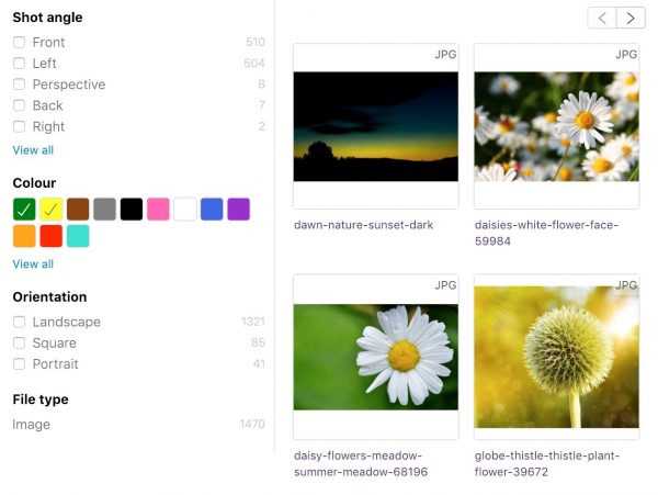
- Within the search results page, we have added the ability to search for images with certain colours in. Ideal to help users filter search results to suit a particular colour theme they are looking for
- The improved rich text editor in CMS pages and folder properties with additional support for custom HTML code
- Rich text editor: Ability to add zoomable images
- Add a picture somewhere in the content – keep the res relatively high, e.g. 1-2000px when inserting
- Scale it down once it’s in the editor by selecting it then dragging the bottom-right handle left/up
- Select it and hit the Zoom button (see screenshot)
- Save changes
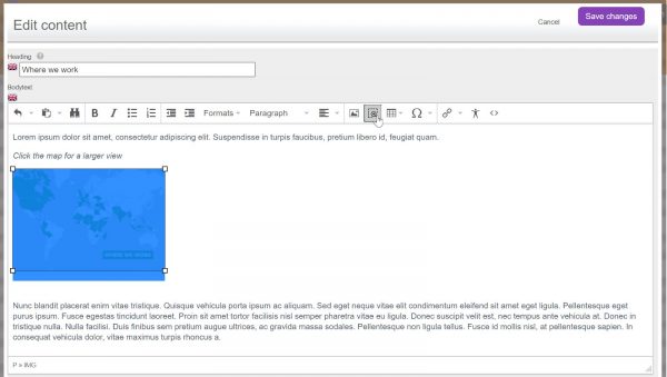
- End-users can then click on it and see a zoomed version of the image:
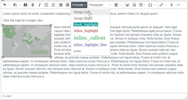
- Rich text editor: Easily left or right-align images with text run-around
- Select an inserted picture
- Go to Formats and choose Image Left or Image Right
Bug Fixes
- Various bug fixes.