In my 25 years in the branding industry, I have probably been part of 50-100 branding and rebranding projects and I have the scars to prove it! Branding projects are hard. Of course, there are numerous and varied challenges to be overcome across the strategy, design and rollout phases. However, there are a number of technical issues that go wrong when it comes to the basics of rebranding that I’ve seen derail projects on a surprisingly regular basis.
At Brandworkz, we provide brand management software for both rebranding projects and ongoing brand management which can help address a lot of these issues. However, many of the often-overlooked issues I want to address today are easy to avoid if they are simply considered upfront. If they’re not, they can easily cause no end of misery for a Brand Manager once the brand has been launched and it’s out in the wild. So, let’s get started before that happens to you!
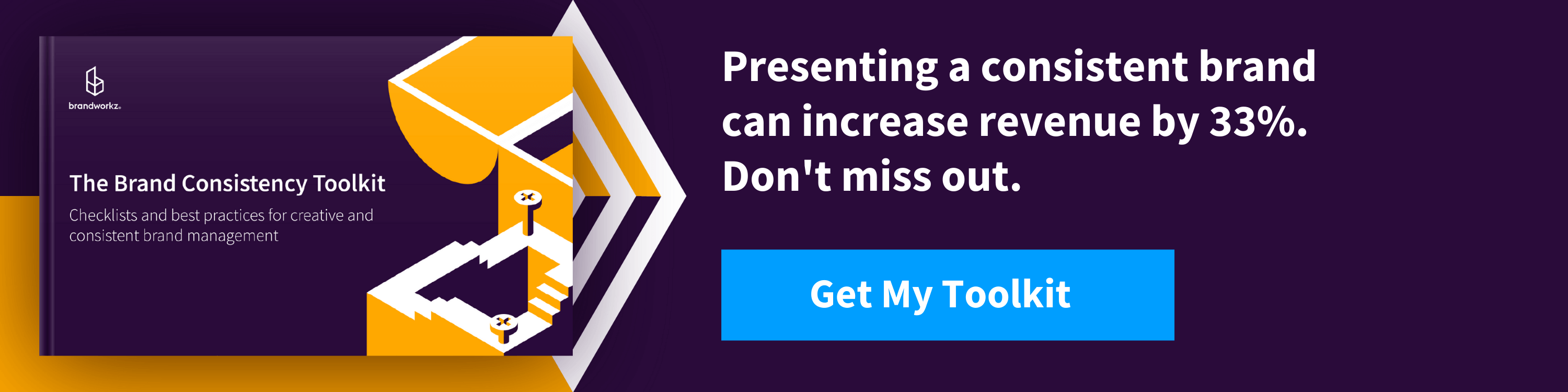
Additional resources: Brand consistency is a critical part of an effective rebranding. Check out our free resource — The Brand Consistency Toolkit — for help creating a flexible and consistent brand management solution.
1. Fonts
When it comes to the basics of rebranding, there’s no better place to start. Fonts! nobody wants boring old Arial or Times New Roman as part of their cool new brand, especially not the Creative Director. It’s therefore very common for designers to choose a custom font, i.e. one that isn’t part of the Mac or Windows operating system, and many designers favour fonts that have a rich set of weights/cuts, for instance Helvetica Neue which has no less than 59 styles from Ultra Light to Extended Black!
Requirement 1: Font choice
If you’re not using MS Office at all then lucky you, you can go mad and choose virtually any font under the sun. However, if you do use MS Office, or Google G Suite, then you can either choose to specify a more basic font specifically only for Office use, or you can dumb down your font choice across the board in the name of Office compatibility.
You can of course purchase/download custom fonts and install those on all your end-users’ computers but these won’t work in Office Online or G suite. Also, if these docs are shared externally with 3rd parties for collaboration, they won’t see them correctly unless they happen to have that font installed. You can embed some fonts in a PowerPoint file but it doesn’t always work so I wouldn’t rely on that feature.
If you want to be completely sure to not have any font problems in MS Office on either Windows or Mac then you are basically limited to these —
- Arial
- Arial Black
- Tahoma
- Trebuchet MS
- Verdana
- Courier New
- Georgia
- Times New Roman
If you are using Google G Suite then have a look in the Font dropdown on a Google Doc where you can also hit “More Fonts”. You can’t install custom fonts to G Suite. For a full list of fonts supported by Office Online see this Microsoft support article.
Requirement 2: Font weights
In MS Office, forget about using any font weight beyond the four standard weights “Normal”, “Bold”, “Italic” and “Bold Italic”. Weights like “Semi bold” or “Light” won’t work properly because when end-users press the Bold or Italic buttons the software will expect those weights to be present, otherwise it will start simulating those styles itself, often with bad results.
On the web, this isn’t a problem as most custom fonts come in both desktop and web-font formats with all of the different weights included. However, as part of your digital brand guidelines you need to specify how these should be handled in terms of the CSS because there are several ways of specifying the weights, e.g. “font-weight: 700” or “font-weight: bold”. If you’re not loading custom fonts as part of your website then you also need to remember to specify fallback fonts in case the first one isn’t present on the end-users computer, e.g. “font-family: Trebuchet MS, Helvetica, Sans-Serif” This can be done with a brand guidelines software.
Requirement 3: Web font formats
The font format you should use on your website will depend on whether you are hosting these fonts yourself or are using an online service such as fonts.google.com. The fonts hosted by Google are all open-source and you can auto-generate the CSS to include these directly from their servers. The links they generate will “sniff the browser” and serve only the best format back to the browser, typically WOFF2 for most browsers as this offers the best compression.
If you’re hosting the web fonts on your own servers then in your @font-face statements you need to specify one or more formats/URLs to the font files.
We recommend specifying only these two:
- WOFF (Web Open Font Format): Supported by all major browsers including Internet Explorer 9-11.
- WOFF2: Newer version of WOFF with better compression. Supported by all major browsers apart from Internet Explorer.
There are also three further web font formats, but they can and should be omitted these days:
- TTF (TrueType): While supported on most browsers it’s not compressed so not as good as WOFF/WOFF2.
- EOT: A Microsoft-specific format supported only by Internet Explorer, but IE9 and later supports WOFF anyway.
- SVG fonts: Needed for very old versions for iOS Safari, but this has supported WOFF2 for many years. SVG fonts have also been deprecated in the SVG 2.0 standard and don’t support font hinting, so won’t look as good at small sizes.
Requirement 4: Desktop font format
In terms of your corporate desktop font format, you should make an OTF (OpenType) format available to install. You can also install TTF (TrueType) on both Mac and Windows, but OTF is more modern and offers more features e.g. better support for large character sets for non-Roman languages.
Requirement 5: Email font
You should also consider your font choice for emails. This is especially true if you do email marketing because your choice of font, and especially font size, can significantly influence your conversion rates. There is a great article on that here.
For our own brand font we ended up choosing the excellent Source Sans Pro, a free, open source font from Adobe and available on e.g. fonts.google.com. We use it across both print, web and MS Office, although for office only the Normal, Bold, Italic, Bold Italic cuts.
We have installed it on all employee computers and it also happens to be available in Office 365/Online as well as Google G Suite so it works in all cases apart from if we share an MS Office doc with an external agency and they open it in the desktop app, a small compromise we are willing to live with.
Tip for large companies: Finally, if you are part of a large organisation and are going down the custom font route then talk to your IT department EARLY. They will most likely have centralised deployment software for all employees’ desktop configs and will be able to push a custom font to thousands of desktops automatically, but will also need some lead time to do this.
2. Colours
Colours are another core component of your visual brand. I’m not a designer, so I won’t comment on the very subjective world of colour choice in terms of emotional meaning and distinctiveness compared to your competitors, etc. What I’m looking at here are technical issues and omissions that I’ve seen time and again.
Requirement 1: Accessibility
Catering for people with disabilities isn’t just a legal requirement in many countries, it makes good business sense. A certain proportion of your customers will have poor or deteriorating vision, and if they can’t easily read what it says on your website (because the text is too small and/or doesn’t have sufficient contrast) it will turn them off. Google will also penalise you on your SEO rankings if you don’t have enough contrast.
My experience is that many designers are more interested in the aesthetics of what text looks like on a page rather than how easy it is to read. The number of times I’ve seen mid-grey text on white in design projects over the years is too many to count. Don’t slip on up this basic rebranding fundamental that is so easily avoidable.
If you have had exposure to website design then you will probably be familiar with the (rather inaccessibly named) W3C WCAG 2.1 accessibility guidelines — the global standard for web accessibility. In my view, it will serve you well to adopt the colour contrast requirements of these guidelines for text across all media, including print. Then, you will ensure good readability everywhere.
There are three levels — A, AA, and AAA — with AAA being the strictest. However, achieving AAA will seriously restrict your choice of brand colour so you may be better off aiming for AA. That’s what we settled on here at Brandworkz. The contrast requirement for small/body text is stricter than for large text/headings, so your designer can get more creative on the heading styles. Check out this colour contrast checker we like to use if you want to try some of these specifics out for yourself.
Requirement 2: Secondary and tertiary colours
Your designers/agency will have picked both one or more primary brand colours as well as some secondary ones, but are there enough secondary ones? You might need more than you think.
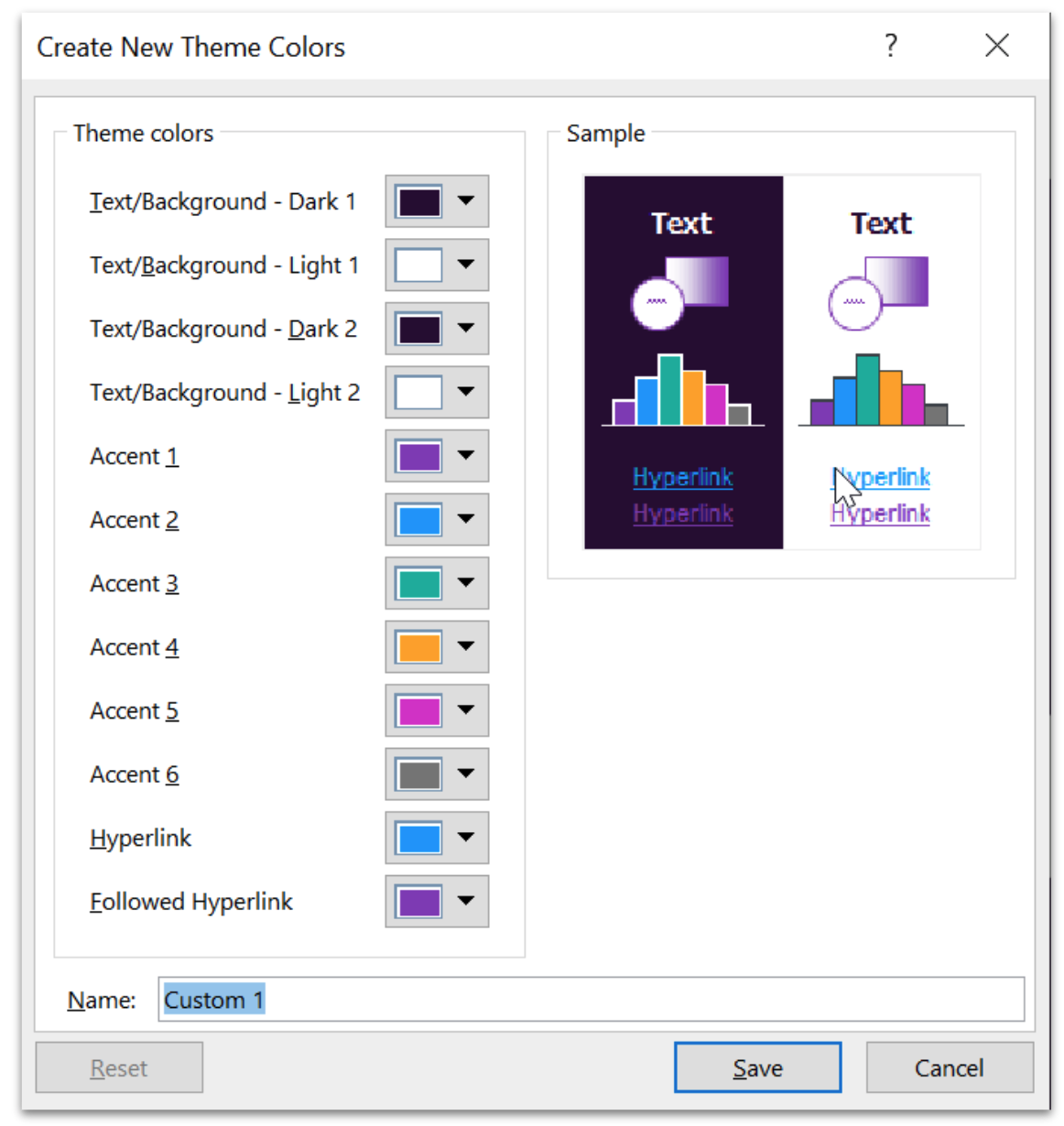
For example, if you use PowerPoint then you will want to create a branded template. When you do, you need six secondary colours. You might think… Why do I need so many colours? Bar charts are one example. Below is the “Colors pop-up” (found by going to View -> Slide Master -> Colors -> Customize Colors) where you can see that six Accent colours are needed. If you only enter some of those colours, then PowerPoint will start using its defaults when yours runs out — which might not look great.
In terms of the primary text/background colours, then PowerPoint has two slots for each. You may want to simply enter the same colour for both — e.g. Dark 1/Dark2 and for Light1/Light2 for a more consistent colour palette.
 In terms of tertiary brand colours, this would typically be a number of official greys or other fairly neutral shades. These are often overlooked by agencies/designers when they come up with a colour scheme. If you ignore tertiary colours, then you will essentially just end up using random greys across different web-UI elements, dividers, lines etc — which isn’t great for consistency or aesthetics.
Requirement 3: specify CMYK colours for print
Even if you are a “digital native” company, you will probably need something printed at some point. For example, if you do merchandising or need panels printed for an event. Although this can be done from RGB colours, the colours may not be what you were expecting depending on the method of printing. However, it’s not a lot of extra work to get your designer to specify CMYK values for your brand colours for you as well as RGB/hex, if it’s done up front.
There are no colour contrast checkers for CMYK that I’m aware of, but if the designer starts with RGB and makes sure they adhere to e.g. AA contrast requirements they can work backwards from there choosing corresponding CMYK colours.
If you do high-volume printing with Pantone colours, then you of course also need those defined as part of your corporate colours.
Remember, if print is important for you, then by far the best test is to actually get a marketing item such as a leaflet printed on a professional press in a couple of copies and on the paper you are going to use.
Basics of rebranding pro tip : If your designer is a digital native then they have most likely specified a dark grey for your body text as opposed to black. This looks great on screen, but a CMYK printer doesn’t have a dark grey ink available and will have to approximate it by doing a dot pattern. Dark grey text will never look as crisp as black text when printed. There is a reason why virtually all books are printed with pure black.
3. Logos
At the risk of stating the obvious, your set of logos will most likely be the creative files used and also abused the most out of all files in your entire company — so, they have to be right because changing them down the line will be a nightmare.
Of course, there are variations from one set of logos to another in terms of permutations, usage, sub-brands, tag lines, etc. However, there are a generic set of base requirements that I believe should fit the bill for most logo systems and need to be considered no matter what your requirements may be.
Requirement 1: Light/dark backgrounds
Ensure you have versions for both white/light background and black/dark background.
Below are ours. We also have both landscape and square/stacked versions to use depending on the space available. This may or may not be needed for you depending on the design of your logo. If you have both then remember to state which one is preferred.
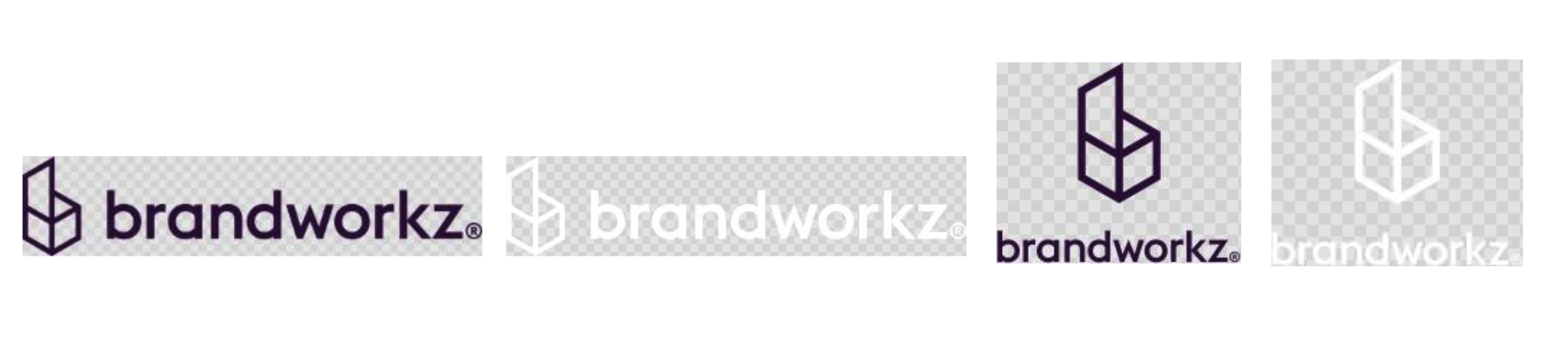
Requirement 2: Icon variations
Ensure you have an official icon — typically your mark in a square — for apps, favicons, etc. You may want to create positive and negative/white versions. Sometimes just the mark on a white/transparent background is needed, but most of the time a white-out logo on a dark/coloured square will stand out better. Here are ours:
![]()
If you want to add some icing on top for your icons, then you might also want to consider that as an alternative (or in addition) to your fixed-colour SVG icons you can create a single SVG icon (e.g. for Favicon web-use), which auto-adjusts to light/dark mode (e.g. on Mac and Windows) through adding some simple CSS inside the SVG. Check out this blog for more details.
For your website Favicon, check out this link which will tell you if you have in place all the various formats and sizes that you ideally need, and also auto-create any that are missing.
Requirement 3: File formats
Here are my format recommendations for the typical Logo use cases — most of which require a specific file format for best results.
Note that the advice provided here is assuming that your logo is graphic, i.e. is a series of lines and curves, as opposed to photographic, which changes formatting best practices.
- Website: For your website, SVG files are the best option. This is because it’s a vector format so can be used at any size without loss of quality and they are super small in file size.
- Other online uses (social media, emails, etc.): Use SVG files where possible. However, SVG isn’t supported by all online apps, making PNG with transparency your go-to backup for these scenarios. As this is a bitmap format you will need to decide on a pixel/cm/inch size — taking into account both resolution and file size. If you create the files at 10cm at 300dpi (roughly 1200px) then there is enough resolution for most use cases, and the file size will typically be in the 20-30kb range depending on your logo shape. However, the ideal scenario is to let users request the exact resolution they need — something you can achieve with a professional DAM (Digital Asset Management) system, like ours.
- MS Office: Office applications, along with other business applications like bookkeeping apps are best suited for PNG formats. This is because Word Online, along with Google docs, don’t support SVG and possibly never will because they represent a security risk if bad guys are able to upload them. This is because they can have embedded Javascript which will execute in a web browser.
- Motion graphics: If somebody is going to make your logo fly from outer space down to earth X-Factor style for broadcast intros, then you will probably also need RGB Adobe Illustrator vector .AI files as an option.
- Print: As mentioned in the Colour section, even if you are a digital native company you will probably need to print your logo at some point, so you may as well get these done up front. CMYK logo files for print should almost always be done as vector files in Adobe Illustrator and saved as either .AI or .EPS files (doesn’t matter which one, there is no real difference). If you are doing high-volume Pantone-based printing then you will also need Pantone versions as Adobe Illustrator vector files.
Basics of rebranding pro tip: You may also have heard of Google’s relatively new WEBP image format. This is optimised for photography and isn’t supported across all browsers yet — making it a poor choice for most logo use cases.
Requirement 4: Registered trademark symbol
The legal/registration aspects of a logo and new company name are way beyond this article. However, they are, of course, super important to square off EARLY, otherwise you may have a court case on your hands courtesy of your lovely new logo/name — pretty much the worst-case scenario for any rebranding project.
In the context of your logo design, the main issue here can sometimes be whether to use the (unregistered) trademark ™ symbol vs the Registered ® trademark symbol. If you and your legal team want to sleep soundly at night, you should get any new or updated logo registered in your relevant territories — if you need the name of a good trademark lawyer then drop me a line.
However, registration of a new mark takes several months and you can’t officially start the process until the design of the mark is finalised which often creates a Catch-22 if you are on a tight deadline. You need to take legal advice from a trademark lawyer as EARLY as possible, especially if there is a new/changed company name in the mix.
If you can’t get the registration done by the time you need to launch, it may be tempting to create a temporary set of logos with the ™ symbol and then swap them out with ® equivalents once the registration has come through. However, it can be very hard to stamp out the ™ versions down the line if they are out in the wild. If your lawyer is fairly confident about getting a registration then it will probably make sense to create ® versions from the start, but not do anything with them other than a soft/internal launch until it’s registered.
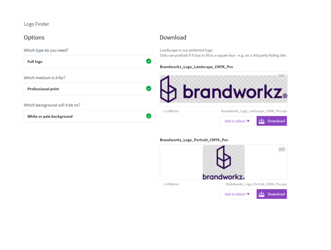
Requirement 5: Make it easy to access the right logo
Having all of these different logos is great — in fact, it’s essential. However, bringing this to life means making these different logos available to users. Realistically, you need a system that’s able to make that possible to users without any prior knowledge of your brand, or requiring casual users to read some intricate logo guidelines. The importance of this cannot be understated. If they don’t understand which logo to use then the chances are that they will pick the wrong one or simply copy-paste the one your web-team has put on your website.
In our own brand management system we have built a Logo Finder function to make this intuitive for users:
If you are going to use a manual solution, your teams will broadly be dependent on file naming conventions and manual metadata to find what they are looking for. Ultimately, coming up with a file naming scheme is important anyway, and you should define logical naming conventions which identify each file — e.g. landscape/portrait, RGB, CMYK, etc. We also recommend including your company name (e.g. Brandworkz_logo_landscape_RGB_pos.png) to simplify sharing those assets with third-party agencies.
4. MS Office Word and PowerPoint templates
I have used MS Office for over two decades and I’m still discovering new things about it. In many ways, they are amazing apps — sometimes even better than the Adobe CC suite for certain design uses. However, it takes around a decade to properly learn and appreciate them — at least it did for me! If you are somewhere on that learning curve and have been tasked with creating a new set of Office corporate templates you will probably find yourself using a combination of online how-to articles and swear words to pull off the job to a reasonable quality. Then comes the risk of taking ongoing flak from your colleagues once they start using it if it doesn’t work well for them.
If you are creating a new brand, or are in charge of a rebrand, and your organisation is a medium to heavy user of either Word or PowerPoint, then if at all possible you should allocate some budget to get an “Office Professional” to create your templates. If you don’t, then your company will pay manyfold over down the line via a thousand cuts of annoyance, loss of productivity and loss of brand consistency.

How to get Office templates done right
When I say “Office Professional”, this is typically not an internal employee or even the branding agency designing your brand. You may have an “Office wiz” in the company, but they will most likely not have produced very many brand templates, if any, and won’t have the experience which comes with having done this a number of times.
Also, most creative agencies loathe Microsoft to the point that they even create their invoices in Adobe InDesign! So, unless they explicitly state on their website that they regularly create MS Office templates and can show you relevant examples of these, then don’t use them for it.
What you really need is a company that specialises in MS Office template creation. They are often not creative agencies so will typically need the main branding agency to design the basic layouts and they can then take that design, interpret it for Office use and produce high-quality templates.
However, even with dedicated specialists, it’s virtually impossible for anybody to create perfect templates from the start. So, get a couple of “normal” people to use the templates for some real-world document creation as a pilot. Various issues will then no doubt be flushed out which can then be fixed in a second iteration before the templates are let out into the wild and lots of documents are based on them.
Basics of rebranding pro tip: You also need to ensure that the templates are easily available to end-users, ideally from within MS Office itself. Your IT department may be able to help you achieve this with native Office 365 functionality, or you may want to consider software that can make the latest templates available as an Add-in to Office which will give you more control. Brandworkz has such an Add-in.
5. Core messaging/writing style/tone-of-voice guidelines
Most graphic designers would probably not count anything to do with writing style as being part of the “design basics”, and to some degree they are right. However, as a massive generalisation then this also means that many — especially smaller — branding agencies don’t typically view these types of guidelines as part of the core set of deliverables they should be creating for you. They may not even include it as an optional add-on when doing a rebrand quote if they don’t have a dedicated copywriter in-house. In fact, my experience is that a surprisingly large proportion of great graphic designers are in fact dyslexic which goes some way towards explaining it.
Needless to say, you should strive for as much consistency and distinctiveness in your writing style, tone-of-voice and core messaging as in the graphic design, not least as there are quite a lot of marketing channels where there is almost zero option for visual branding, e.g. Google AdWords, auto-personalised sales emails, blog posts and certain types of social media posts.
It’s beyond this blog post to give a full laundry list of the common things that I think should be in these types of guidelines, but below are some quick pointers —
- Core messaging: Should probably be the very first thing done as part of a brand/re-brand, and goes all the way to the CEO as this should be your absolute best, well-articulated sentences about why people out in the world should care about your company (over and above your competition).
- Writing/house style: The nut-and-bolts of how to write. E.g. how do we write our company/product names (e.g. Company Name ™ or CompanyName®), do we write in e.g. US or British English, do we write 1-9 as numbers or words, etc.
- Tone-of-voice: Do you want to come across as e.g. a friendly/fun or serious/professional company to do business with, including examples of this.
Basics of rebranding pro tip: You may want to consider investing in Grammarly Business. This will catch more general writing issues. However, you can also set up house styles to auto-correct e.g. incorrectly formatted brand names, etc. Remember, you need to make things simple to do, rather than simply demanding users memorise a laundry list of requirements. This applies to every element of brand consistency, not just writing guidelines. Again, check out our Brand Consistency Toolkit for help maintaining consistency and flexibility.
Getting the basics right keeps you focused on the big picture
Everything we’ve discussed here is in the nitty-gritty of branding. When starting on your branding journey, thinking about file types and font variations isn’t as exciting as the big picture changes to the future of your business. However, they are important, and if you don’t get these specifics down early, they will bite you in the future.
Our mission at Brandworkz is both to help you bring across the big picture as well as helping you automate all the little things so you can stay focused on the creative and strategic aspects of brand management. For example, making it easy to find the right logo and enforce metadata creation in order to free your teams to get creative with their designs, rather than waste time hunting down the transparent SVG file, only to realise they needed it as a PNG.
Maintaining control over all your branded material, updating that content, and distributing it across your organisation is one of the largest challenges involved in a rebrand — full stop. Brand management software short-cuts the technical solutions without skimping on the quality. Get in touch if you want to learn more about how we can help with your rebrand, or book a demo today to see why over 100,000 marketers are using our brand management software every day!